

Your shopping experience should be fun and your theme’s totally agrees with you. This is why, the theme is compatible with the most well-known ecommerce plugin in WordPress market — WooCommerce.
WooCommerce comes with plethora of sophisticated options that you could explore by using the plugin documentation or by experimenting them directly in WordPress Dashboard → WooCommerce.
In this chapter, we will focus your attention just on elements that your theme brings up to enhance your shopping experience beyond what WooCommerce could offer by default. In order to do so, go to Appearance → Customize → WooCommerce.
Theme Options
The features from Theme Options affect globally the Shop overall experience. Let’s explore them:
Product Catalog
- Shop Page Display — choose what to display on the main shop page.
- Category Display — choose what to display on product category pages.
- Default Product Sorting — choose how should products be sorted in the catalog by default.
- Products per Row — choose how many products should be shown per row.
- Rows per Page — choose how many rows of products should be shown per page.
- Display options
- Display type — choose between 4 types of cards: Default, Fade, Pinned or Plain. Read more about cards.
- Hover color transparency — overlay color transparency while hovering by mouse. The overlay color is set up in Theme Options when choosing General → Colors → Feature color. It affects just Fade and Pinned Types
- Columns Spacing — choose spacing between columns
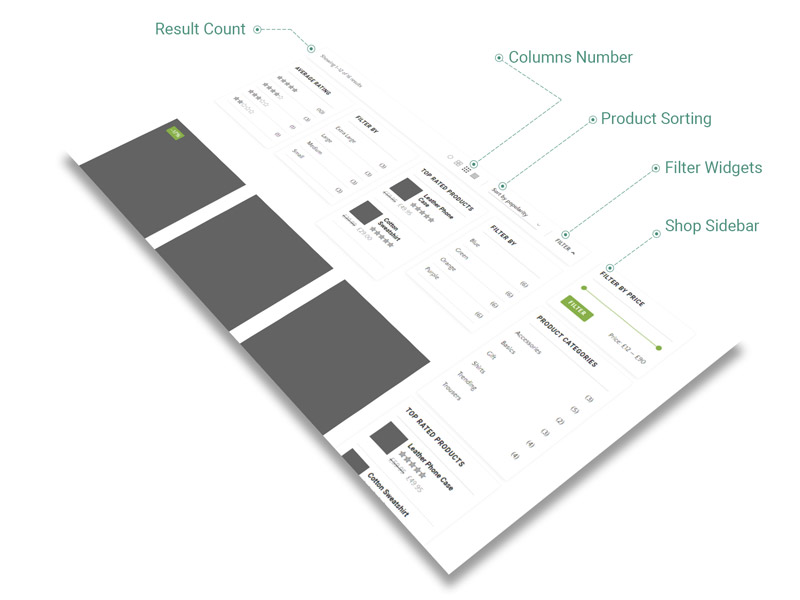
- Filter — it refers to products categories filter on shop page
- Columns — pick number of columns from 1 to 6
- Cross-sells Products Autoplay — if enabled, slider plays automatically
- Upsells Products Autoplay — if enabled, slider plays automatically
- Related Products Autoplay — if enabled, slider plays automatically
- Catalog Mode — if enabled, it globally hides the price and Add to Cart button on Product Cards and Pages
Product
The options below are available for Single Product pages.
- Spacing represents the amount of space Product elements fills up from the total width of browser window. When adding spacing, the width of content is reduced with a certain amount of pixels, either by left or by right side.
- left — add spacing to the left side of Product Content
- right — add spacing to the right side of Product Content
- Visibility section helps you to decide which elements of Single Product will be visible to visitors. See more about visibility items. It has the following options:
- Related Products — located almost at the bottom of Product, there are showcased products that has the same categories as the actual one. Find out more about Related Items.
- Navigation — located at the bottom of Product page, the link is conceived to redirect the visitor to Shop page. It includes the Previous Product link, the Next Product link and All Products link
Header
The options below take effect just in the header of your site.
- Shop Icons Visibility — you can show/hide the following icons: Wishlist, My Account, Shop Cart
- Wishlist icon
- Items Background — pick any color for the item background color
- Items Text — pick any color for the item color
- My Account Icon — you can decide the behaviour of My Account icon while clicking/hovering on the icon
- Enable My Account Popup
- Cart Icon
- Items Background — pick any color for the item background color
- Items Text — pick any color for the item color
- Cart Popup — you can decide the behaviour of your cart while clicking on cart icon
- Cart icon link — choose between Cart popup or Cart page
- Add to Cart Popup — if enabled, Cart Popup appears when Add to Cart is triggered on archives pages. This is effective just when Add to Cart does not redirect to the Cart Page
Ribbons
- Hot — it refers at Featured Products
- Background — choose the background color for the ribbon
- Color — choose the text color for the ribbon
- Sale — it refers at products with a new sale price
- Background — choose the background color for the ribbon
- Color— choose the text color for the ribbon
- New — it refers at products added in the last n days
- days number — for products added less then number of days (pick days number)
- Background — choose the background color for the ribbon
- Color— choose the text color for the ribbon
- Out of Stock — it refers at Out of Stock Products
- Background — choose the background color for the ribbon
- Color— choose the text color for the ribbon
Single Product
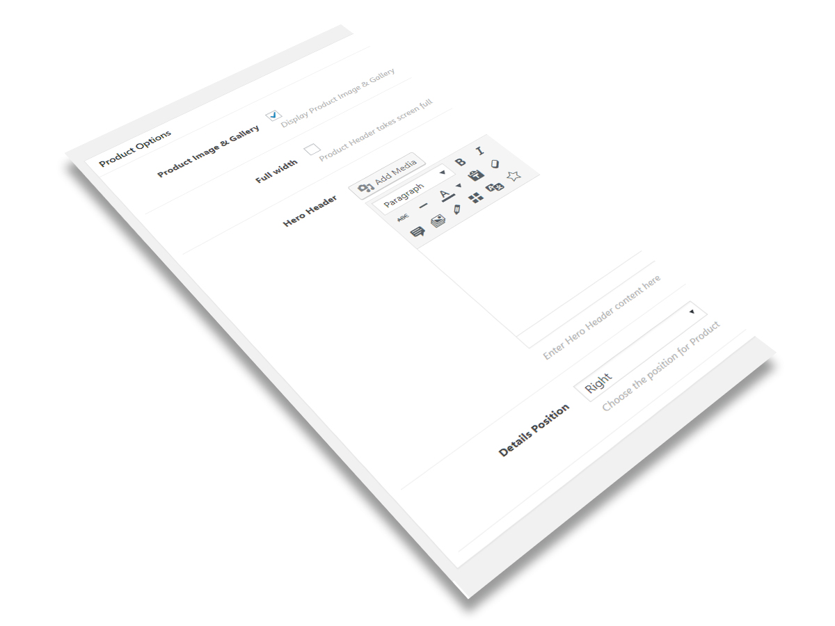
Beyond General Options and Masonry Archive Options that are well-described and explained in General Options chapter, Single Product page features one more panel of options that is called Product Options:
- Product Image & Gallery — you can enable/disable the Product Image & Gallery on Single Product Page
- Full width — Product Header takes screen full width size
- Hero Header — it represent the element you could emphasize your product with and make it unique. You can add any type of content here — from media items to shortcodes — the perfect opportunity to unleash your shop creativity.
- Details position — choose the position for Product Details. It works the same way as Project Details.
- Sticky Details — product details are sticky while scrolling for Right and Left positions
- Product Video URL — enter Youtube or Vimeo video link here. Video shows up while clicking on Gallery Video button
Products
Products represent a powerful and flexible shortcode that allows you to showcase creatively the content, initialized before in Products section. It consists of two parts (as general principle, it is quite similar to Projects Shortcodes):
- information data — it is connected with Products Post Type, where Products Shortcode takes data from, like Title and Subtitle (represented by Reviews and Price)
- display data — it is composed of own options that allows to choose what type of content to show and how to display it
The Products options are classified in two main groups:
- General Properties — common for almost all types of Products
- Display Typologies — depending on Products type, these options are different
General Properties
- Products Type — filter products by Top Rated, Best Selling and Sale Products
- Product Visibility — filter products by Visible, Catalog, Search, Hidden, Featured
- Products Categories — filter products by categories; leave empty to select all products
- Categories usage — filter based by category usage
- Product Tags — filter by product tags
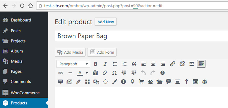
- Products — you can choose specific products to display, by entering their ID’s, separated by comma. The ID could be taken from Product URL
- SKUs — choose product you want to display (comma separated Products SKUs)
- Order by — products can be organized by Date, Title, Author, ID, Last modified date and Parent ID
- Order — choose between Ascending and Descending order
- Number of items — enter the number if products to display
- CSS class — in case there is a need to add more style rules
Display Typologies
There are three ways the Products will showcase on a site page, depending on your needs (for more visual details, please see):
- Masonry — a grid with multiple columns
- Carousel — similar to slider, but carousel is able to showcase more than one items at one time. Read more about carousels.
Common Options
- Display — the way products are displayed: Shadow, Move, Fade, Rising, Plain, List
- Columns — how many products columns are displayed (1, 2, 3, 4 or 6)
- Columns spacing — spacing between columns (pixels)
- Overlay color — color layer that covers the product when possible (exceptions: Shadow, Rising, Plain and List cards)
- Overlay color transparency — color layer transparency (100% means the color is transparent)
- Color skin — choose between light or dark skin
- Animation — the way items appear on page while scrolling
- Animation delay — set a delay time for animation, in seconds — Minimum: 0 seconds, Maximum: 3 seconds
Masonry
- Categories filter — positioned inside General Properties panel because of technical reasons, it helps to sort products based on categories: Main Categories shows just the categories without its child-categories, if comparing to All Categories
- Filter Position — choose between Left, Center and Right
- Animation Effect — per unit or per whole block
- Progress Delay — set animation delay (in seconds)
Carousel
- Autoplay
- Autoplay Speed