

The Shortcode Media Elements are conceived to showcase your portfolio or other interactive items, like images or videos, in so many creative manners.
They stand as independent design elements, enhancing the existing page content, but they could be a part of other shortcodes, like Columns or Row.
As Shortcode Basic Items, this type of shortcodes have the specific feature for allowing no content to be embellished inside them. There are two shortcodes of this type: Album and Projects.
Keep in mind By embellishing content, we mean the use of any WordPress Editor tools or the insertion inside the same shortcode of any other shortcodes offered by your Theme.
Even if at first sight, these two shortcodes are similar in the matter of options and display, there are couple of important features that differentiate them. By knowing the distinctions between them, you will know better how and in which specific situations you need to use each of them.
Album
- it extends the functionality of Album Post Type
- it creates custom entry points to any type of site content: Post, simple Page, Product, even a Project. You can also avoid linking Album Items at all (in case you just want to create a custom gallery)
- the Album Item could be either image or video
- Album Item could stand as gallery item, without linking the item itself to a specific content
- you can visit the Album Item content just via a Button, not by clicking on image
- it can display a list of heterogeneous elements (Post, Page, Project, Product) in the same instance. The list is showcased as Masonry, Slider or Carousel
Projects
- it extends the functionality of Projects Post Type
- it designates entry points just to Single Project page, where the project is described in more details. This is the only type of content you could link your Project Item to.
- Project Item is represented just by the featured image
- Project Item always links to one type of site content — a Single Project page
- you can visit the Project Item content just by clicking on the image
- it can display just a list of Projects in the same instance. The list is showcased as Masonry, Slider or Carousel
Album
Album is a powerful and flexible shortcode that allows you to showcase creatively the content. It consists of two parts:
- information data — it is connected with Album Post Type, where Album Shortcode takes data from, like Title, Subtitle, Description or Button label and link
- display data — it is composed of own options that allows to choose what type of content to show and how to display it
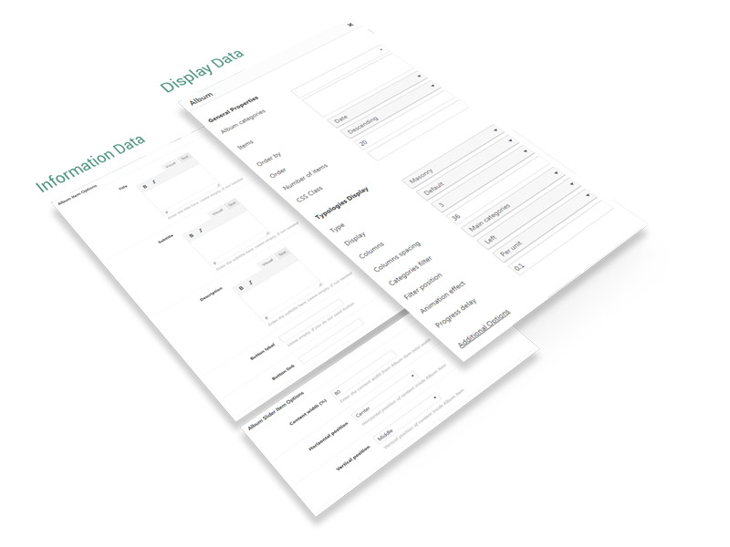
The Album options are classified in two main groups:
- General Properties — common for almost all types of Albums
- Display Typologies — depending on Album type, these options are different
General Properties
- Album Categories — filter items by categories; leave empty to select all items
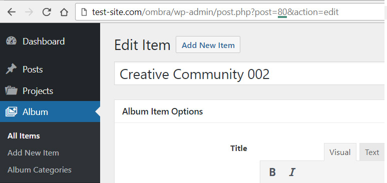
- Items — you can choose specific items to display, by entering their ID’s, separated by comma. The ID could be taken from Album Item URL
- Order by — items can be organized by Date, Title, Author, ID, Last modified date and Parent ID
- Order — choose between Ascending and Descending order
- Number of items — enter the number of items to display
- CSS class — if it’s necessary to add more style rules
Display Typologies
There are three ways the Album will showcase on a site page, depending on your needs:
- Masonry — a grid with multiple columns

- Carousel — is able to showcase more than one items (image or video) at one time. Read more about carousels.

Common Options
- Display — the way items are displayed: Default, Fade, Pinned, Plain.
- Columns — how many items columns are displayed (1, 2, 3, 4 or 6)
- Columns spacing — spacing between columns (pixels)
- Overlay color — color layer that covers the item when possible (exceptions: Fade, Pinned cards)
- Overlay color transparency — color layer transparency (100% means the color is transparent)
- Text Color Skin — choose between light and dark skin
- Animation — the way items appear on page while scrolling
Masonry
- Categories filter — positioned inside General Properties panel because of technical reasons, it helps to sort items based on categories: Main Categories shows just the categories without its child-categories, if comparing to All Categories
- Filter position — choose between left, center or right
- Animation effect — per unit or per whole content block
- Progress delay — set animation delay effect (seconds)
Carousel
- Autoplay Checkbox
- Autoplay Speed
Projects
Projects represent a powerful and flexible shortcode that allows you to showcase creatively the content, initialized before in Projects section. It consists of two parts (as general principle, it is quite similar to Album structure):
- information data — it is connected with Projects Post Type, where Projects Shortcode takes data from, like Title and Subtitle (represented by Taxonomies and Comments number)
- display data — it is composed of own options that allows to choose what type of content to show and how to display it
The Projects options are classified in two main groups:
- General Properties — common for almost all types of Projects
- Display Typologies — depending on Projects type, these options are different
General Properties
- Projects Categories — filter projects by categories; leave empty to select all projects
- Projects Tags — filter projects by tags
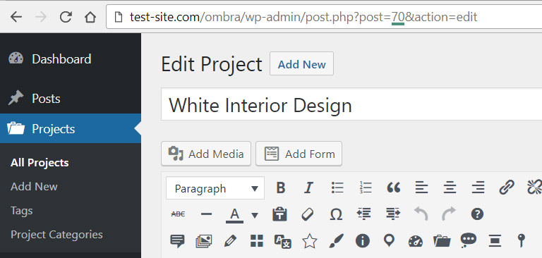
- Projects — you can choose specific projects to display, by entering their ID’s, separated by comma. The ID could be taken from Project URL
- Order by — projects can be organized by Date, Title, Author, ID, Last modified date and Parent ID
- Order — choose between Ascending and Descending order
- Number of items — enter the number if projects to display
- CSS class — in case there is a need to add more style rules
Display Typologies
There are three ways the Projects will showcase on a site page, depending on your needs (for more visual details, please see):
- Masonry — a grid with multiple columns
- Carousel — similar to slider, but carousel is able to showcase more than one items at one time. Read more about carousels.
Common Options
- Display — the way projects are displayed: Default, Fade, Pinned, Plain.
- Columns — how many projects columns are displayed (1, 2, 3, 4 or 6)
- Columns spacing — spacing between columns (pixels)
- Overlay color — color layer that covers the project when possible (exceptions: Default, Plain cards)
- Overlay color transparency — color layer transparency (100% means the color is transparent)
- Text Color Skin — choose between light and dark skin
- Animation — the way items appear on page while scrolling
Masonry
- Categories filter — positioned inside General Properties panel because of technical reasons, it helps to sort projects based on categories: Main Categories shows just the categories without its child-categories, if comparing to All Categories
- Filter position — choose between left, center or right
- Animation effect — per unit or per whole content block
- Progress delay — set animation delay effect (seconds)
Carousel
- Autoplay Checkbox
- Autoplay Speed